


Best Epson P700/900 driver settings and print detail
Epson P700/900 driver settings and print detail
What factors affect fine print detail
Update: Also applies to the Epson P5300/5370

No more Google ads. Too many deceptive and irritating adverts.
Any ad links left are non tracking, to companies we know, trust and we've worked with for years [Park Cameras]
Ads helped pay for site running costs, so if you found something useful, please
...Make small KoFi donation?
...Subscribe to Keith's YouTube Channel
...Get Keith's book about how to use tilt/shift lenses
Our site contains affiliate links - these help support the site. See our Advertising policies for more
Is there a ‘best’ print setting for printing?
NOTE that this article covers general aspects of things like PPI and DPI. It isn’t just for a particular printer.
There are lots of print quality settings in the driver for the Epson P700/900 printers, there is often also the choice of how much image detail to send to the driver from the original image.
This has led to a lot of ‘web wisdom’ about optimal printer and driver settings for the best quality. As with much such ‘wisdom’ Keith has often wondered if it could be outdated and based on best practice from 15 or more years ago.
This article looks at some experiments carried out with an Epson P700 printer and using Epson’s Premium Luster paper.
There is a video (~20mins)
supplementing this article
Other printers tested with this image
Driver settings and print detail – a balancing act
This is very much a qualitative experiment and evaluation. It’s not about providing detailed optimal settings or the ‘best’ settings. If you disagree with what I suggest, then fine, please go and do some experiments with your own printer – I’m really happy to discuss practical tests, less so theoretical opinions on what one ‘ought’ to do… ;-)
This is about making prints that look good…Ones you are happy with
If you want just a set of settings to use and not think about what you want and what is important in your images and printing, then you will be disappointed. In fact I’m afraid you will be disappointed with a lot of my work, since I’ve long avoided specific step by step guides or recipes. There is no ‘best’ and there is no ‘correct’ answer in printmaking.
Please note that the images here are purely for illustrative purposes – if you want to experiment, get a good image of your own and create the different resolution versions for testing. Using one of your own images is a good way to really appreciate what detail in prints really means…
What am I looking at?
I’m curious about two aspects of printmaking in particular. One is how high in the printer driver ‘quality’ settings do you need to go, and secondly, does sending more image resolution to the printer driver make for more detailed prints.
I’m testing this using the Epson P700 printer. This 13″ pigment ink printer is, from a print quality point of view identical to the larger 17″ width P900. I have reviews and lots more info about the printers in articles and videos.
A photograph
I’m using a photo I took up in the Yorkshire Dales with my 50MP Canon 5Ds. The actual image is one I’ve comfortably printed at A2 size, so I know it has fine detail and represents aspects of what I’ll typically print.

The image has had a little sharpening applied, but that doesn’t really matter here, since I’m interested in how the printer driver translates pixels in the image into dots of ink on the page.
Sharpening is vital to the perception of sharpness in a print, and along with many other aspects of editing a RAW camera file image, is important in producing a print that you are happy with. There are lots of techniques for processing files for print and they generally only make much of a difference when the print size becomes larger.
I’ll come back to what I feel is important in prints later, but even at this stage I have to remind those of you itching to get the hand-lens out to check over prints, that real people don’t see most of what worries some photographers about fine print detail.
It turns out that if I take the image above and reduce it to about 5.5″ x 4″ the file resolution become 1440 pixels per inch. What’s so special about this number for driver settings and print detail?
Note that I reduce the size of the image by setting the resolution to 1440 – I do not resample it
Print resolutions and ‘magic numbers’
Two terms I’ll be using always deserve some clarification, since people often use them somewhat interchangeably, when they refer to different things.
BTW I’m using ‘inches’ here for convenience and my US audience ;-)
Pixels per inch (ppi)
My image above is a grid of pixels of different colours. These pixels have no inherent size until I decide to show the image at a particular size.
So, if one side of the image was 1000 pixels across and I printed it so that side was 10 inches long, then the resolution would be 100 pixels per inch (ppi). At 20 inches long this would give me (for the same 1000 pixels) a resolution of 50ppi (1000 divided by 20).
For comparison, the pixels on a typical display are 70-150ppi, but can be distinctly higher numbers on some phones.
Dots per inch (dpi)
When printing, each pixel of the image will be represented by a number of printed dots of ink. The colour/brightness of the pixel is represented by several dots of different colours.
Using the pixels example of 100 pixels per inch, each of those pixels needs to be represented by multiple ink drops. So, if each pixel were represented by a 5×5 grid of potential ink drops, I would have a dot resolution 5 times the pixel resolution of 100ppi, or 500 dots per inch (dpi)
Actual printing
Several features of modern printers contribute to the improvement in printer performance over the years.
- The number of inks has increased in many printers – a wider range of ink colours makes it easier to get the ink dots for a pixel to better represent its colour.
- The size of ink drops has decreased allowing more to be fitted close together (overlapping or not)
- Ink droplets may be produced at different sizes
- The software/firmware involved in converting pixels to ink drop positions has become much faster and more powerful, allowing more and more complex calculations to be carried out in the limited time available at normal print speeds.
One of the most under-appreciated aspects of inkjet printer functionality is the sheer amount of calculations required to control the inkjet printhead as it flies over the paper. Epson has quite a lot of web material covering their print head technologies if you are curious.
To print at a reasonable speed, each colour ink channel in the printhead has multiple nozzles firing out droplets. These are usually arranged in lines at right angles to the direction the print head moves.
The gap between the nozzles and the need for multiple passes of the head to build up a printed image gives a natural amount of movement if for example you wanted the droplets of one sweep of the printhead to match up with droplets from previous passes.
In Epson printheads (for smaller printers) this produces a basic pattern at 360 per inch. In reality, the control of fine movement of the head and of the paper advance can give finer movements than this, but when you look at printer driver settings with resolution numbers in them, they often come in multiples of 360. So 720,1440, 2880, 5760 etc.

The print head from the Epson P5000 – a larger printer I use. Each of the dark stripes contains two rows of nozzles, giving 10 sets in all. Various nozzles can be firing or not firing 40-50,000 times a second.
If I take an image at 360ppi then ink droplet calculations are a bit less complex than if the source image was at 365ppi
It’s this limitation on complexity that helped push the idea that having your source image at a particular resolution produced better results when it came to reproducing detail in prints.
Twenty years ago, the dithering patterns (how the ink drops are distributed) were simpler, they didn’t really look at adjacent pixels, and the maths for scaling and interpolation were simpler (for speed as much as anything).
As I’ve mentioned, the two areas I wanted to look at were whether sending extra detail (higher ppi) when printing made a difference, and whether the various really high (5760) dpi modes of the print driver made much difference, apart from taking a lot longer to print. How much importance should you give to driver settings and print detail?
Making the prints
The image was resized in Photoshop to 1440, 720, 500 and 360ppi versions.
Note that in resizing I’m resampling – the files will be smaller. These are the same size when printed, but just with less resolution.
The 500ppi version is to give a feel as to whether changes from 360 to 720 are gradual or more of a step. If the differences suggest a more stepped response I might do some more versions, but that depends on what’s visible and how much difference I can actually see (and my patience…). If sending more than 360ppi doesn’t make a difference then the prints from the different images will look similar – if that extra detail shows, then it does make a difference.
The files were printed directly at one of the 5 basic quality settings in the (Mac) driver – the names may differ in the windows version, but the variations should all be there.
Here are the 5 print settings, from low to high

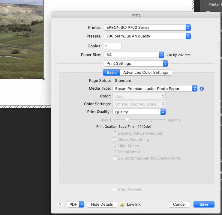
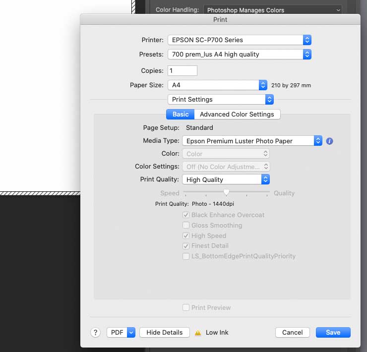

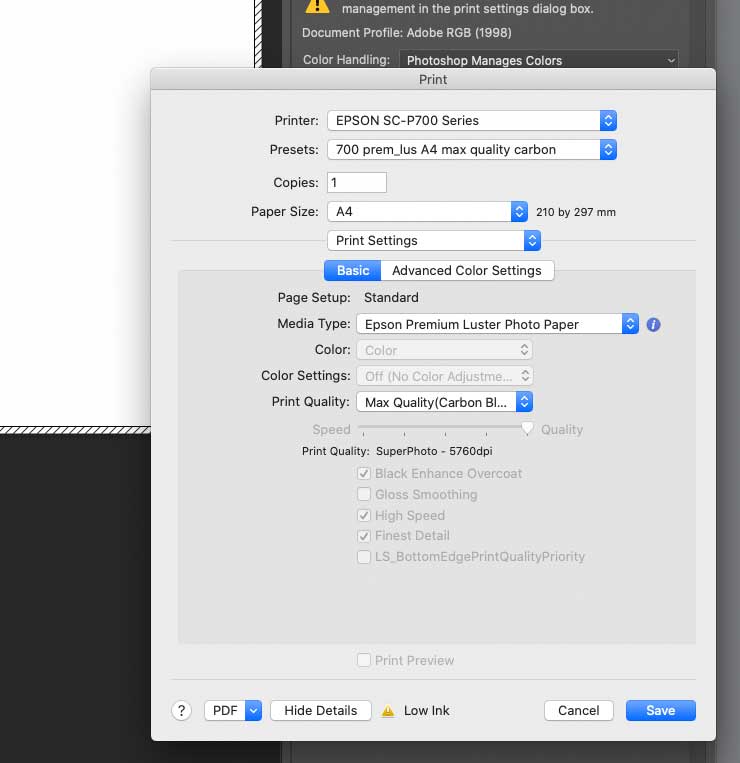
Note how the first three list 1440dpi and the last two 5760dpi.
Looking at the prints
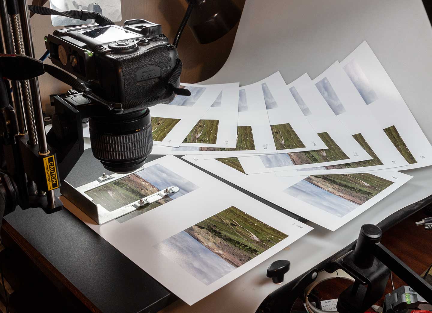
The small images fit two to a sheet of A4 Epson Premium Luster. That gives me 20 pictures on 10 sheets.
I’m photographing parts of the prints at ~1:1 with my 50MP 5Ds and the Canon MP-E65 macro lens I use for much of my commercial macro work (mostly electronic components).
At this point the natural curl of the paper is a bit of a nuisance, but I only need part of the image absolutely spot on in focus.
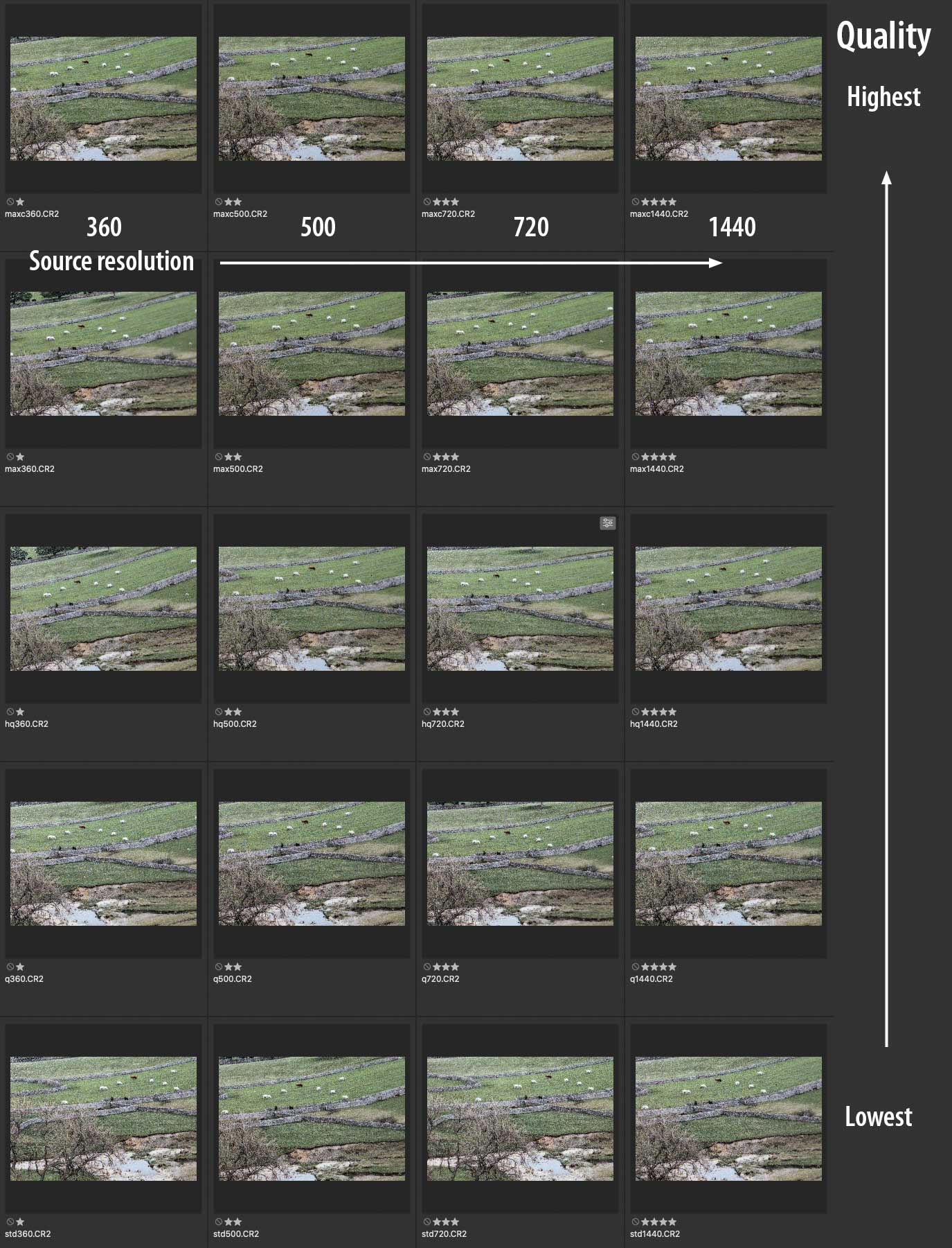
Here’s the full set of pictures, from when I was processing the RAW camera files
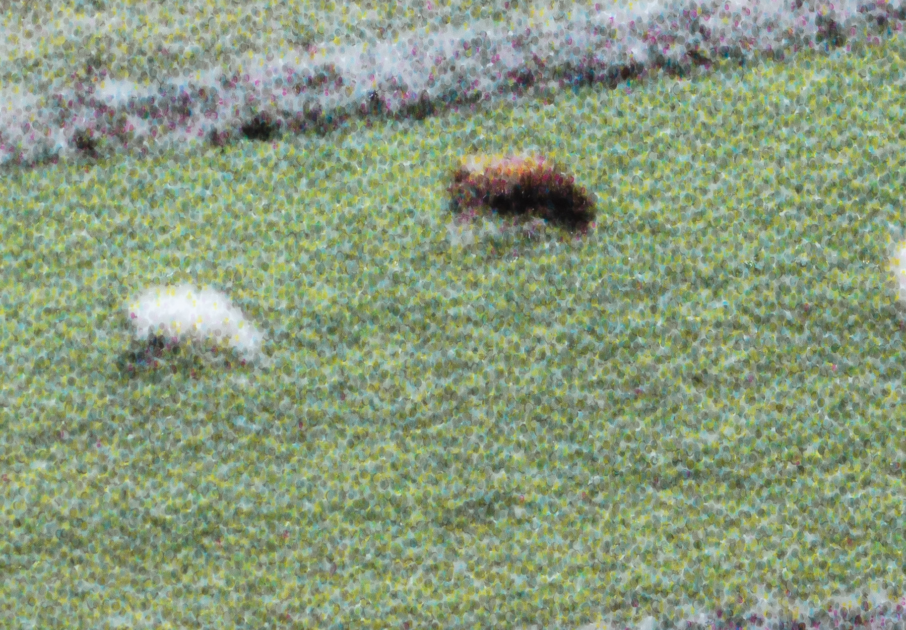
Here’s the part of the original full resolution image at 100%

The actual ppi for this image depends on your monitor and just how you are viewing this article.
As ever, put this small bit of the whole image in context before you think it looks a bit lacking in detail…
Looking at the dots – driver settings and print detail
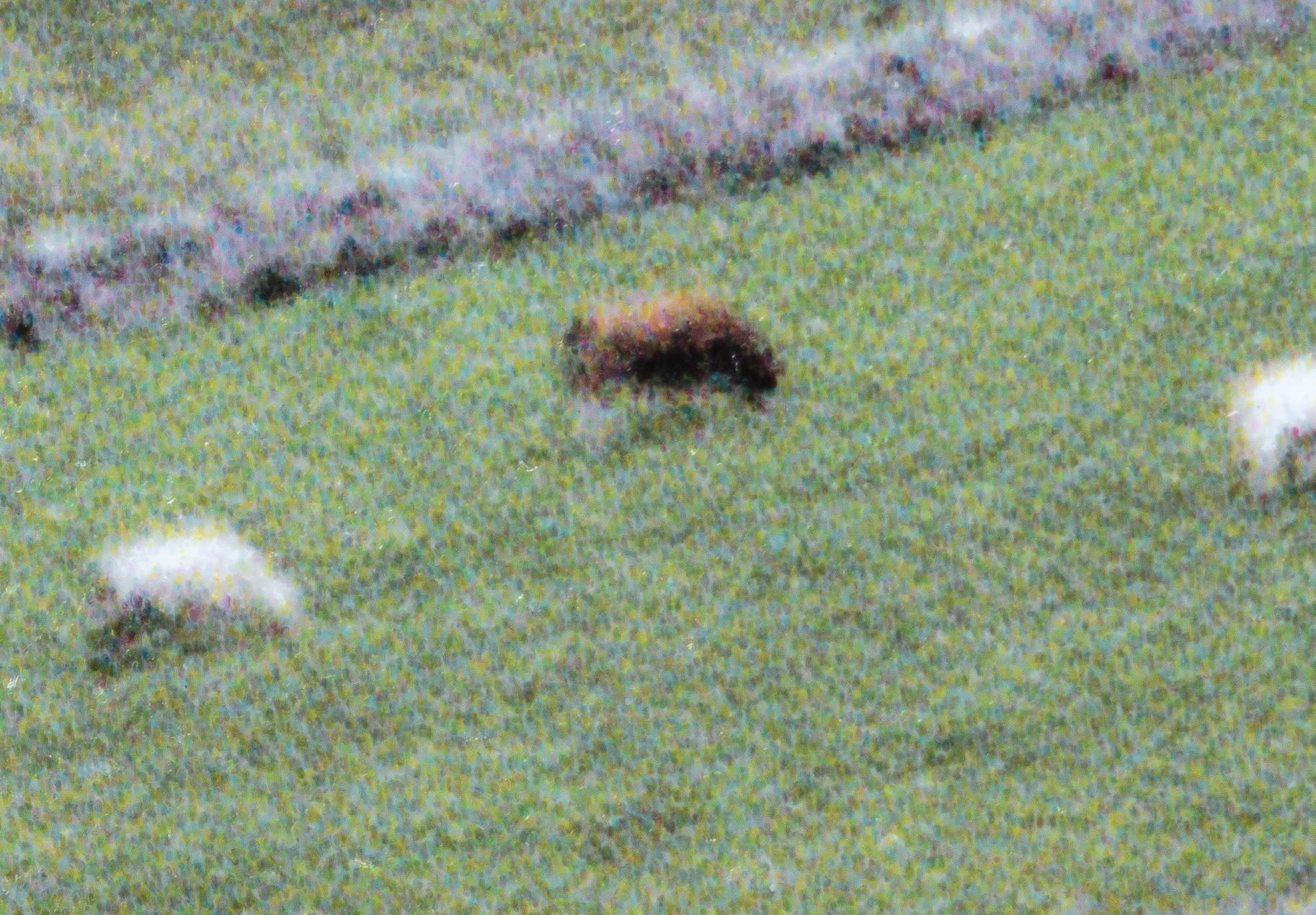
This section is just lots of images from the photos. The images can be double clicked and opened in a new window to see in more detail – just remember how small the areas you are seeing are on the actual prints.
BTW – try squinting a bit to blur the dots? It can help reveal more image detail.
Image at 360 ppi
Fron ‘std’ to ‘Max carbon’
Standard

Quality
Hi Quality

Max quality

Max quality (carbon)
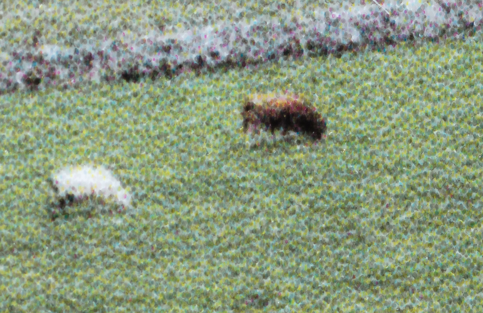
Image at 720 ppi
Now with the same source image but at 720ppi of source resolution.
Note how the vertical post in front of the dry-stone wall is now showing up.
Standard
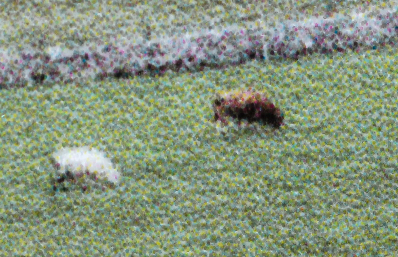
Quality
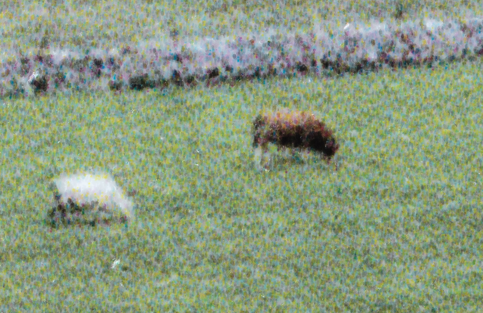
Hi Quality
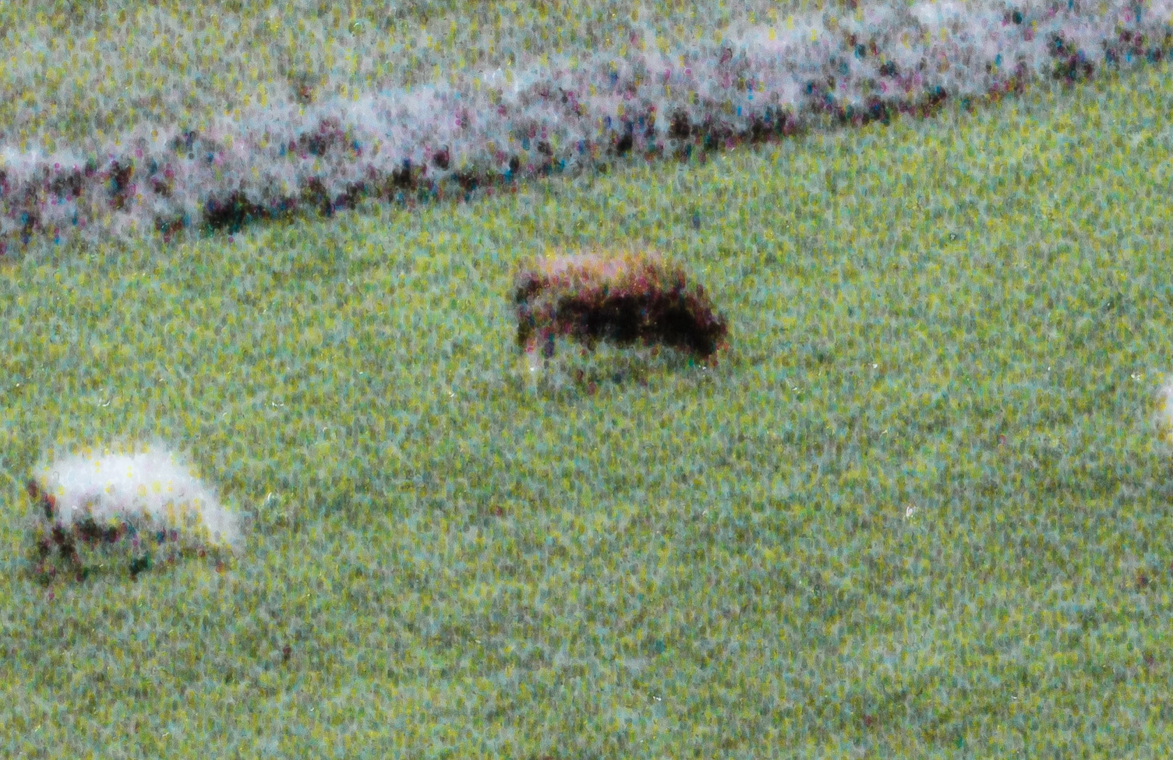
Max quality
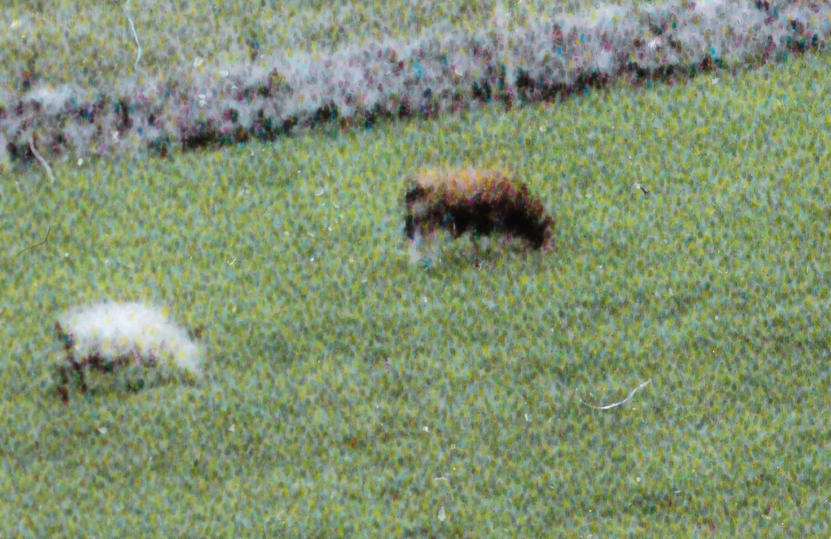
Mac Quality (carbon)
From this I decided that for a combination of detail and shorter print time, for this paper, the ‘high quality’ or middle option probably had what I wanted for a landscape print like this.
Time for a look at quality vs resolution
High quality at different resolutions
Four shots at resolutions from 360 to 1140 ppi – all printed at the medium or ‘high quality’ setting.
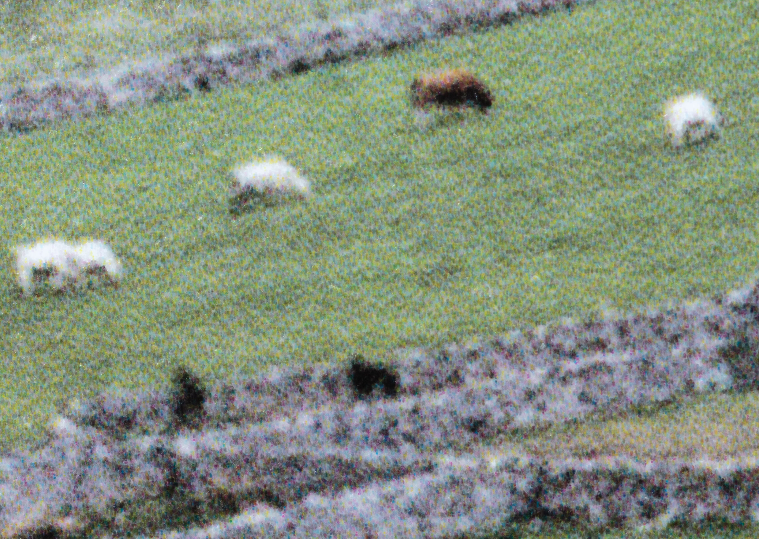
360ppi
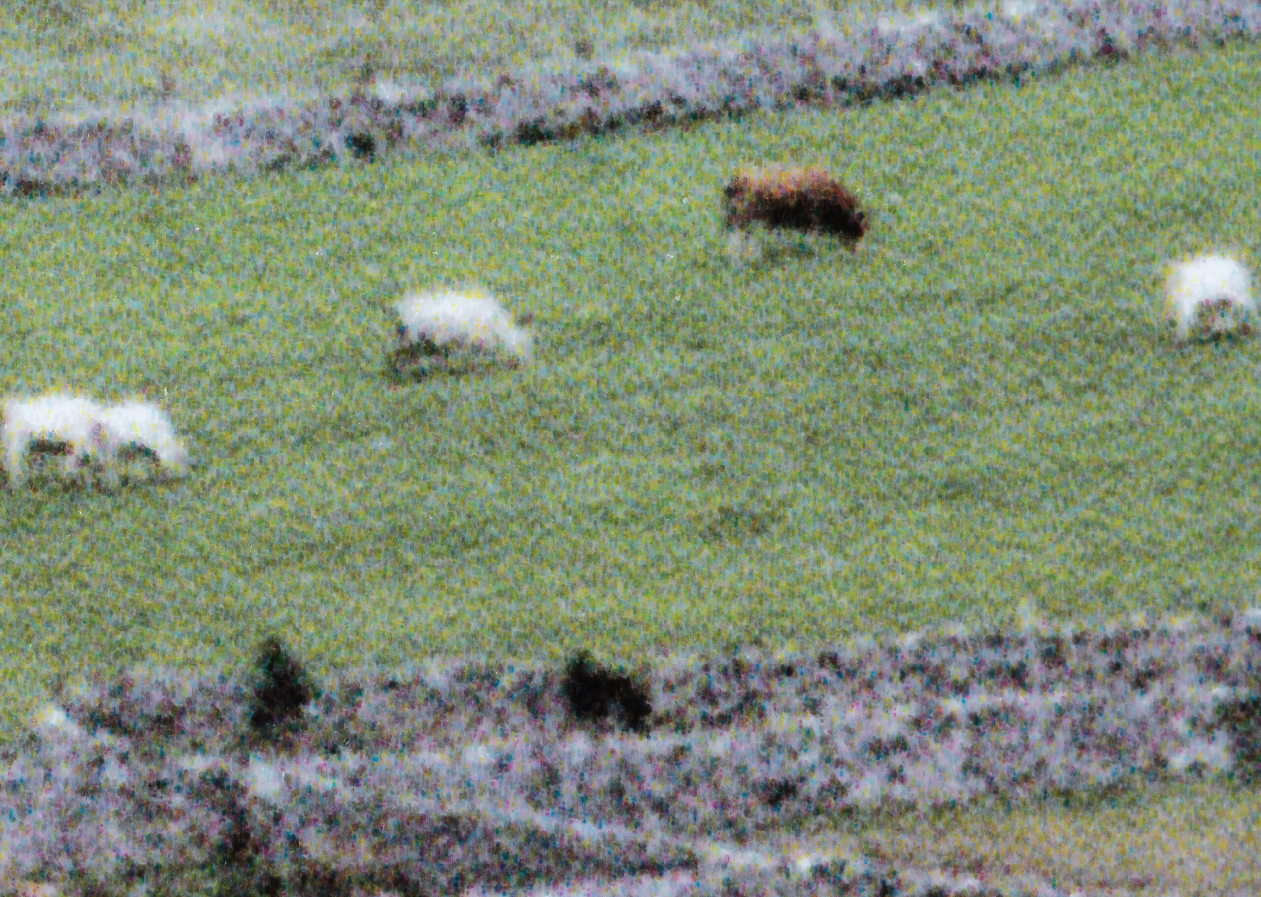
500ppi
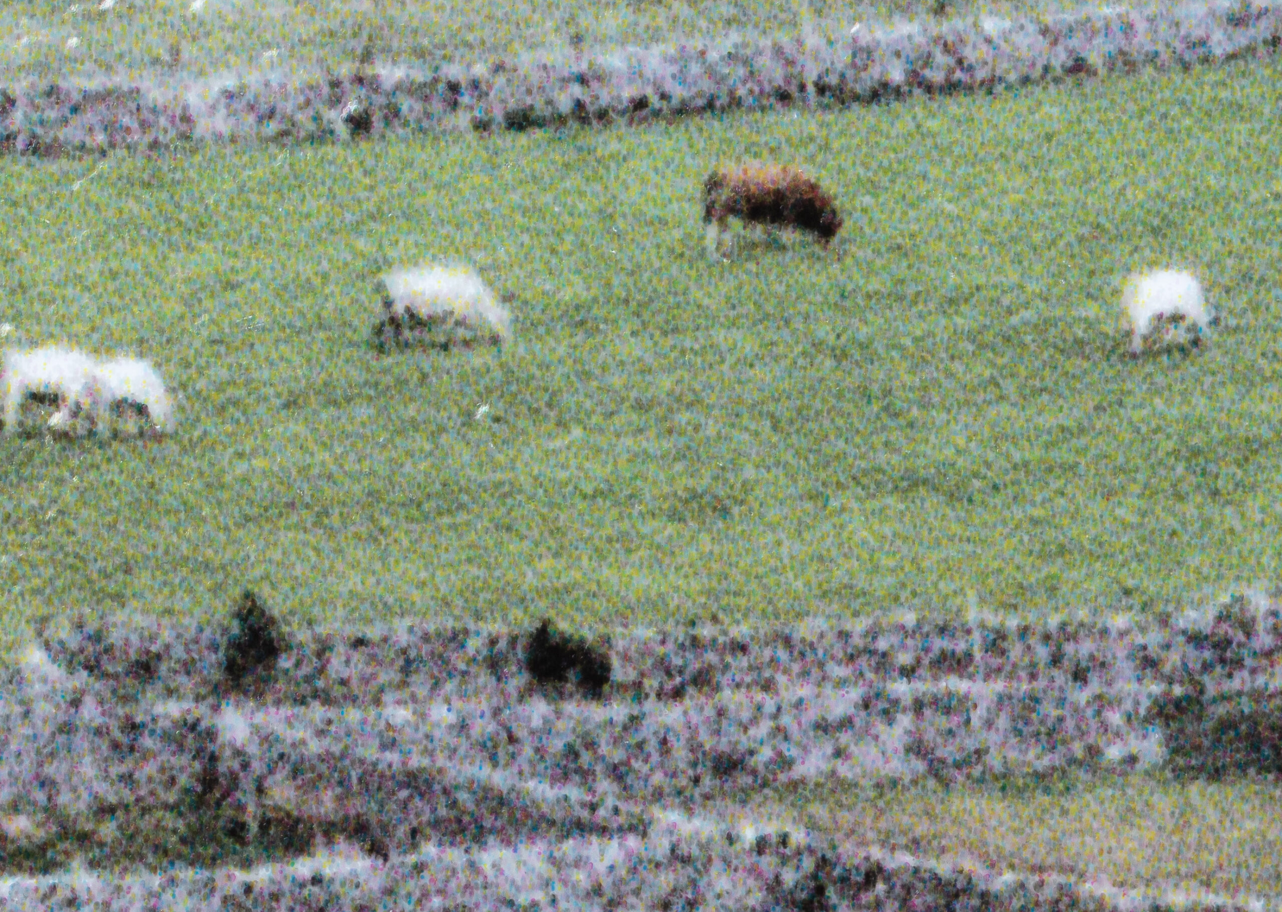
720ppi

1440 ppi
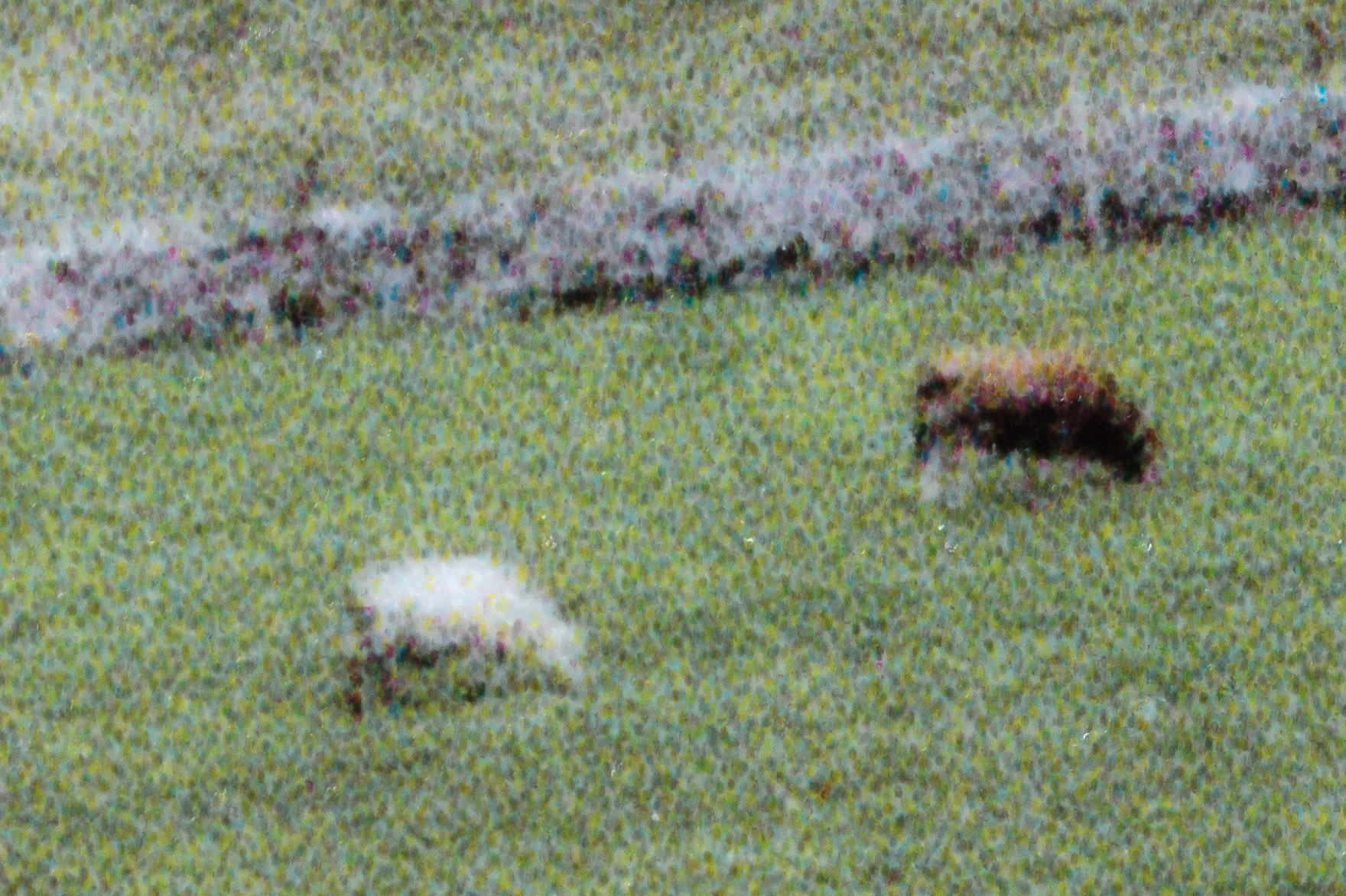
If there is any benefit above 720, it’s not very visible. However there is a clear difference from 360->500->720 which suggests that if you have a big high resolution image, then sending it at higher than 360ppi can give a better looking image.
What about ‘Max Quality (carbon)’
This is the ‘dials at 11’ setting – what to see as I step up image resolution?
As before 360/500/720/1440

360
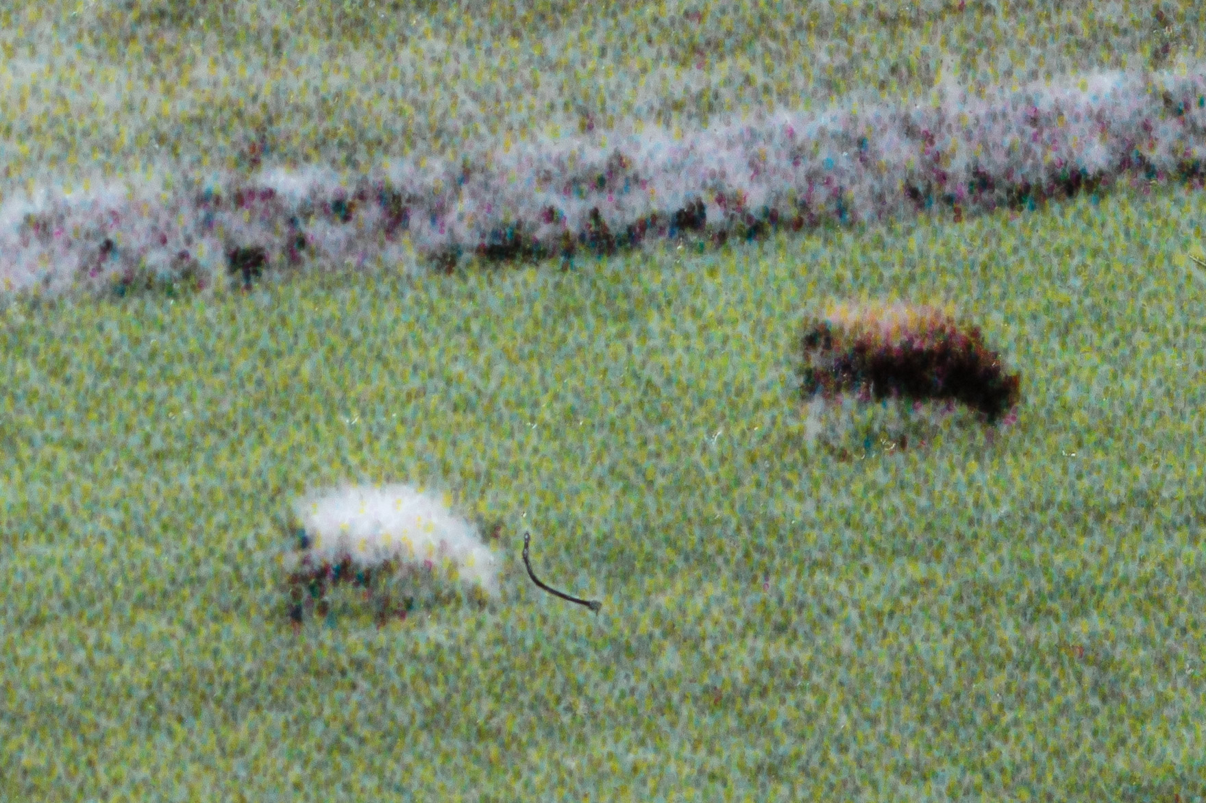
500

720
1440
As before, getting better up to 720, but possibly also a difference between 720 and 1440.
It’s small though…
Have I learned much about driver settings and detail?
OK, what practical use will I make of these tests?
For photo papers I can just about see a little coarseness in the prints at the standard setting. This may partially come about from the tendency of dots to lie in vertical lines, and fits in with the observation that human vision is very sensitive to linear structures.
In context, I need to have my strongest reading glasses on to see this and I’m looking at the prints from close-up. Not so bad for 5″ x 7″ prints, but for myself, pretty unlikely for prints at A3+ size (13″ x 19″)
At the three highest settings I simply could not see any improvement, without visual aid.
So, for most colour prints I’d select ‘Quality’ or ‘Hi Quality’ depending on the paper.
In terms of image resolution I’d use as high a resolution as I had available – this would be especially so for my architectural work, where fine sets of lines are a more common feature than my landscape shots.
One question that comes to mind is what use to make of ‘AI’ type resizing software, such as Topaz Gigapixel AI (see my Topaz reviews and articles covering its use). I’ll come back to this next time I have a larger printer here to test.
Some context – what matters?
OK, so for my own work, printed on a P700/P900 I’m seeing no reason to go anywhere near the two highest resolution settings.
However, there is much more about making a good print than poring over detail so fine that no-one is ever going to see it ;-)
In general I prefer to include ‘better’ quality option in my workflow, such as working at 16 bit, in the feeling that sometimes small improvements can add up to what becomes a ‘better’ end result. This is very difficult (and boring) to test in a meaningful way.
Perhaps I shouldn’t be so quick to dismiss almost invisible detail? Perhaps I should go for the higher quality settings, just because they don’t ‘do any harm’? After all, waiting the extra time for a print is not that much of a problem?
This is where stepping back a bit can literally give a different view.
What was distinctly noticeable was that for the Epson Premium Luster paper I could detect some bronzing at the two highest settings – this confirms my testing for B&W printing with the P700 and P900
The bronzing is visible (under careful lighting) even without my reading glasses, so definitely is an issue that would affect my paper and settings choices for larger prints.
Here are three shots taken at low angles of the sky area of the image.
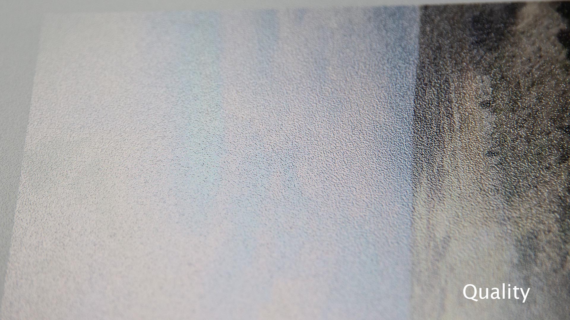

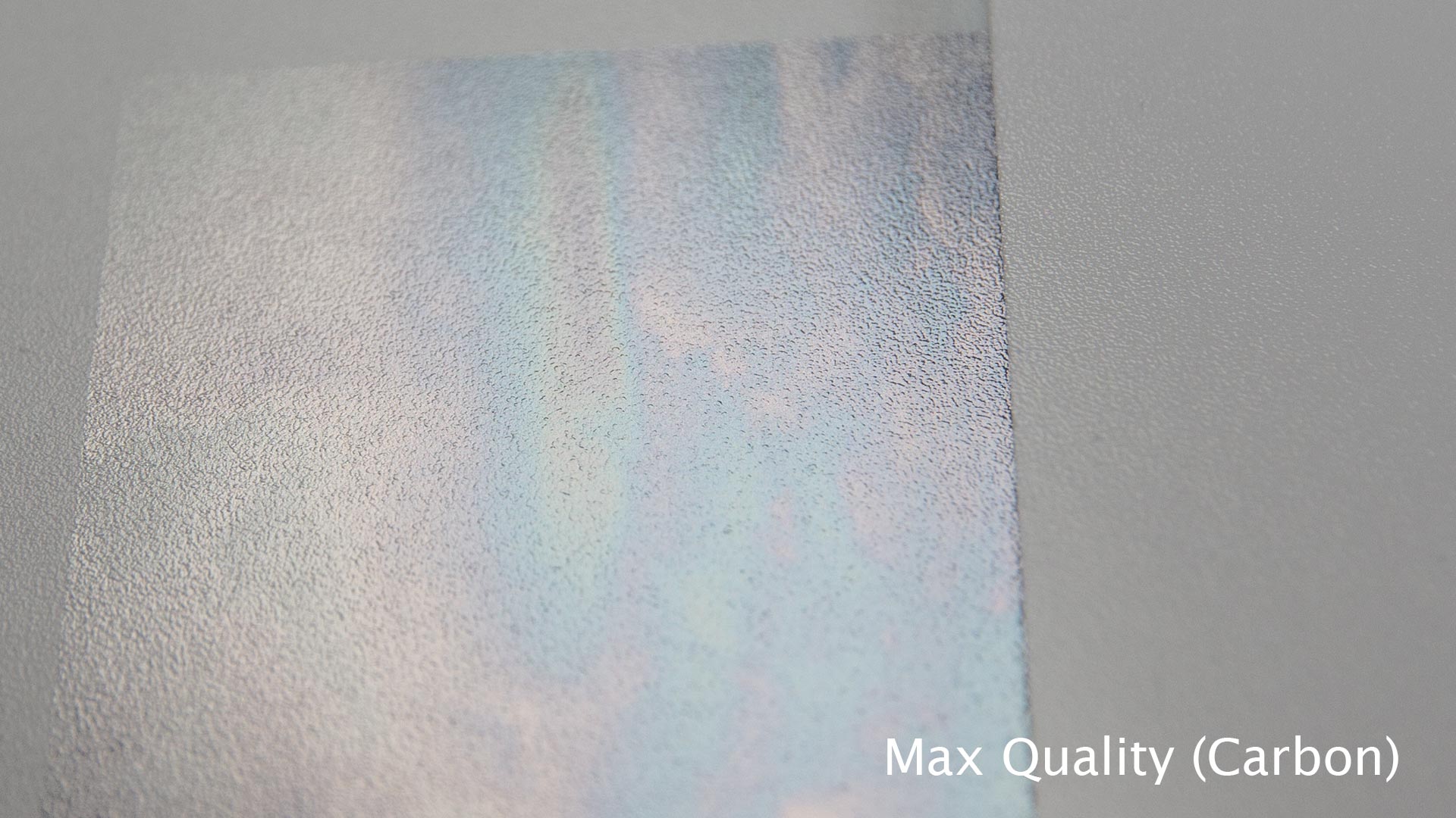
On this paper, the effect is only difficult to see at the ‘Standard’ setting.
I’ve had to take some care to show the examples here, but it is a high level problem that immediately impinges on my use of this paper. It actually means I would not use this paper, on this printer for my images – especially black and white ones (where the printer is otherwise excellent).
This is one of the reasons I always say that you make your paper choices AFTER buying a new printer, not before.
Other paper types
The driver has two settings for matt art papers, such as the Ultra Smooth Fine Art paper setting I use for quite a lot of art papers when profiling.

The difference between ‘standard’ and ‘Max Quality’ is simply 1440dpi or 5760dpi.
If you select ‘Quality options’ you can turn off finest detail and the high speed (bidirectional) setting.
This suggests another set of test prints to look at driver settings and print detail – something for a snow day I’m thinking.
In making prints on the P900 when it was here I generally printed at the best 1440dpi modes, but used ‘standard’ quite often for speed and the fact that I could see no obvious differences.
What about YOUR printer/paper?
I’ve tested just the P700/900 in any detail for this, deliberately picking a very standard Epson paper.
If in reading this you are still inclined to use highest quality settings ‘just in case’ I’d suggest you do a few small prints of a highly detailed image and actually look to see if the differences matter to you. Above all, be honest to yourself…
Don’t be unduly swayed by ‘forum experts’ and anyone who starts introducing any maths into their argument (if not backed up with actual meaningful examples). Watch out too for people extolling the virtues of any particular bit of printer driver software – demand real examples showing the benefits. Chances are they will not have carried out any real testing – not even at the cursory level I have in this article. Even if they have – is it actually relevant?
Above all – test things and learn trust your own judgment ;-)
More testing
I will return to this topic for other makes/models of printer in future, but it’s helped me refine aspects of my printmaking workflow, especially since I tend to work with very high resolution images.
In particular I’m curious about what to do with lower resolution source images. Modern re-sizing software and print sharpening potentially challenge many more aspects of image editing/printing ‘perceived wisdom’.
I’ve looked at printing lower resolution images in the past [Resizing/sharpening old images], but never at how this interacted with what seem to be improved printer drivers.
I can guess some of the answers, but that’s not good enough is it? ;-)
-- --
Never miss a new article or review - Sign up for our Newsletter (2-4 a month max.)More print related information from Keith
...or use the search box at the top of any pageReference pages and test images
- Printer Test Images
- B&W printer test image
- Printer cleaning
- Paper reviews
- Printer info/news/speculation Canon | Epson
Adverts removed
Keith | Mar 22, 2024 at 1:04 pm
Yes – it’s always remembering that most people never see the detail we worry about ;-)
Alan F | Mar 20, 2024 at 1:13 am
This was a fascinating read. Helpful too, but also a little disturbing. I’m relatively new to printing but I had expected your print samples to show more detail of the cattle from the original photo than the sheep-like blobs. Maybe this is why I used to prefer viewing slides rather than prints back in ancient times. Or maybe it’s a benefit of using 50 megapixels and good glass rather than film or only 8 to 12 megapixels.
This is not a negative criticism of your work on this exercise, as I can appreciate the effort involved, but you have revealed to me that I seem to have developed an unreasonable expectation of what prints can show up close. Now I know that I’ll have to stick with viewing them from an appropriate distance instead of wanting to “zoom in” as I routinely do on-screen with my raw files. More importantly, you’ve shown me that it won’t necessarily be my fault or poor printing technique. So, thank you.
Kelly Cannon | Feb 5, 2022 at 2:55 pm
Keith, thank you. I have a P700 coming soon and will put all of this to good use.
Keith | Jan 22, 2022 at 12:58 pm
Thanks – glad it was of interest.
Using software like GP AI is one of the areas I want to explore in some future testing
Ron Sprunger | Jan 21, 2022 at 10:07 pm
Keith, as always you provide helpful perspective on how to evaluate my printer’s performance, and how best to feed it. I’ve always sent my images to my Epson printers (R3800 and now P800] at 360 ppi, with the occasional experiment at 720 ppi.
After reading this, I used Gigapixel AI to double the resolution of a 15.2×22.8 image from 360 to 720, then printed on the same Baryta paper I had used the night before. While the new print was decidedly and obviously “better”, it was also better on my monitor, indicating that Gigapixel had cleaned up and sharpened some small details while doing its work. While I’m not sure sending 720 ppi helps of itself, I am definitely intrigued by the prospects.
Iustin Pop | Jan 21, 2022 at 9:12 pm
Thank you, this is useful. Interesting that 500ppi is better than 360, which suggests that the printer firmware/CPU/printer driver is better than it was many years ago.
Now, I should print a bit more…
Mark Feliciano | Jan 21, 2022 at 8:20 pm
Thanks Keith, very helpful!