


Keith Cooper’s City Light Tonality Presets
Keith Cooper’s Tonality Presets
The ‘City Light’ set for Macphun Tonality

No more Google ads. Too many deceptive and irritating adverts.
Any ad links left are non tracking, to companies we know, trust and we've worked with for years [Park Cameras]
Ads helped pay for site running costs, so if you found something useful, please
...Make small KoFi donation?
...Subscribe to Keith's YouTube Channel
...Get Keith's book about how to use tilt/shift lenses
Our site contains affiliate links - these help support the site. See our Advertising policies for more
Macphun have published some of Keith Cooper’s presets for their Tonality Pro software.
Keith has previously written a review covering many aspects of using the Tonality Pro software for converting colour images to black and white. They can also be used for luminance editing of colour images, where you take a dull colour shot, create a B&W version and then blend this with the original in luminance mode. Don’t worry, this is easier to do than explain…
Presets
The presets specifically cover sets of adjustments that I’ve found useful for producing black and white architectural images.
They are quite deliberately fairly subtle in operation, since in my world, the excesses of HDR and ultra contrasty images rarely meet client requirements.
The idea is that first and foremost you see the image, without wondering what plugin or software was used in its creation.
Article Index

The presets all deal with different aspects of lighting and shadow since you can’t always wait for ‘perfect’ lighting.
Think of the presets as jumping off points for exploring what you want. I’ve an example that shows how turning off one part of the adjustment settings in the preset may look better, and another where the results from Tonality Pro are used as a luminosity blend to enhance a colour image.
[contentblock id=39 img=html.png]
Keith’s Tonality Presets
The basic presets are shown with the colour original, followed by the ‘vanilla’ conversion to black and white and then using the preset.
The colour versions of the images have had minimal processing from the RAW files captured.
Several of the images look relatively underexposed in areas, this is because I often try and retain detail in highlights such as lit areas or the sky.
As digital SLR cameras have improved, the ability to pull detail out of shadow areas allows much more latitude in exposure and far less likelihood of clipping highlights.
I always work with 16 bit images.
Applying any major adjustments to 8 bit files (such as JPEGs) is just asking for posterisation and other undesirable results. Phone cameras may be popular, but have no place in my photography work.
Late Afternoon (rain)
A damp winter afternoon shows the largest permanent market in Europe, in Leicester.
The interior lighting is pretty much balanced in intensity with the light outside.

The basic conversion is just a bit flat

Boosting warmer colours emphasises the lit area with more contrast in the interior.
One way you can see this is by comparing the coloured patches on either side of the market sign.

Late Afternoon (rain) 2
Taken around the same time as above.

The heavy shadowed areas are too dark – no shortage of detail in the sky, but not below, as you can see in this simple conversion.

Smart contrast and boosting warmer colours gives a better view, whilst retaining the essential gloom of a late winter afternoon.

Early evening (rain)
An evening scene – one that works fine for colour (remember that this is an unprocessed colour image).

Quite interesting in B&W, but it lacks some of the ‘glow’ of the colour version.
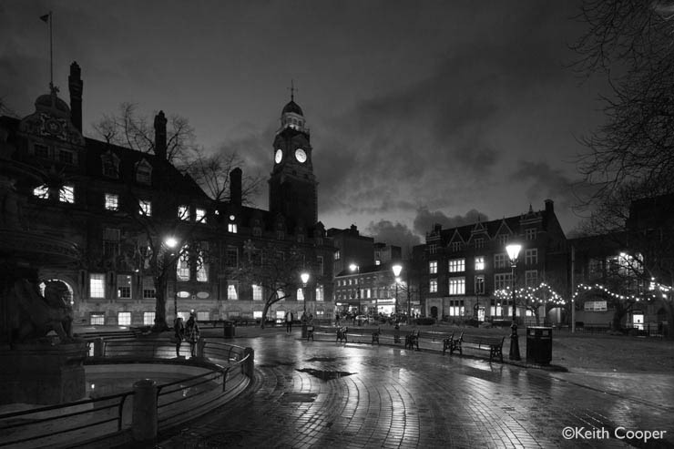
The preset boosts quite a few features in the image. This is one that shows up more effectively at large print sizes.
What works for an image here could easily be excessive on a 30″x20″ print.
If you’re experimenting with it, look at the settings I’ve adjusted in the preset and boost or cut them a bit.
Many of the standard presets push things a bit far for my likeing – I want people looking at the image, not the editing effects.
It’s easy to over-do things so use with care.

Perhaps it’s not so clear what the differences are?
Look again at this, the ‘plain’ conversion. Move your mouse over the image to see the changes.


Daytime
A daytime shot of Seattle, that looks fine in colour

As before, the basic conversion to B&W lacks punch and contrast.

More contrast and lightening some aspects of shadows looks much better as a print.

Daytime Shadow
A frequent problem if you’ve not got a choice in when a shot is taken.
In not burning out the sky (I want to keep detail and colour) the building is heavily shaded.

Moving to B&W looks better in some respects

Using Tonality to boost shadow detail helps a lot, but watch for sensor dust showing up more in skies.
If I was using the image for a print I’d likely mask together both versions in Photoshop using the unaltered sky from above.
Tonality Pro supports layers too, so you could also do it in there (see my reviews for more about making use of layers and masks).

Bright street
Whilst I’ve a whole building in shadow above, looking across the street shows intensely strong shadow.

The basic conversion is a little too high contrast in many areas.

A more balanced range of contrast

Bright Stonework
The bright stonework of Southwell Minster

It’s OK in B&W but lacks a little impact.

Darker skies and a bit more texture in the 11th century stonework.

Alternate uses of the presets
The effects of the presets can be blended and masked in numerous ways.
Luminosity blend
Take this colour image in shade. The sky is spot on, but the shadowed area is just too dark.
Some might leap for HDR, but it’s not needed (almost never needed IMHO).

A black and white version using the ‘Bright Street’ preset

Blend this back with the original colour image as a luminosity mask (and maybe add a bit of vibrance) and you have a much better image.

Luminosity masks like this can easily flatten colour, so be prepared to tweak afterwards.
Partial preset
Take this view of the railway station in Leicester…

Applying the ‘Bright Stonework’ preset works well, but there is too much fine detail in the sky and brickwork for my liking
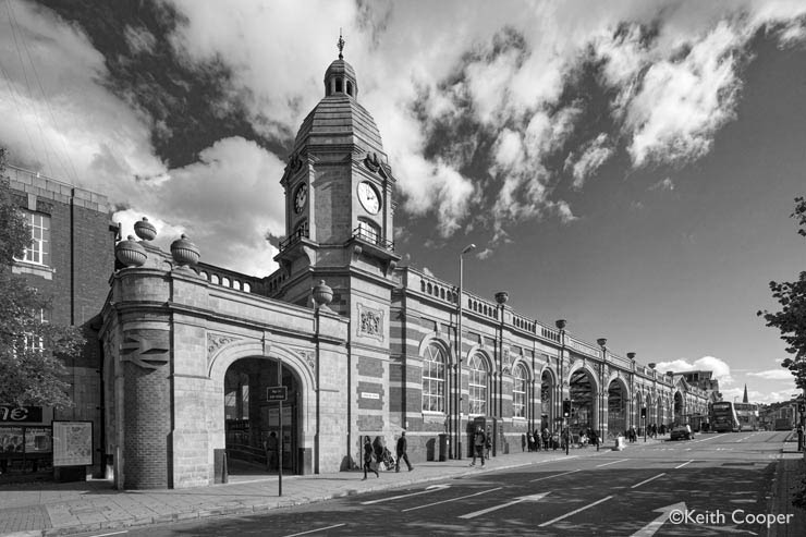
Turning off the clarity and structure options in the Tonality settings just keeps the tone mapping aspect of the preset.
A more subtle result…

Conclusions
Tonality Pro offers so many variations in its settings that it’s all too easy to get lost and miss things it could do.
Look on the presets as starting points to explore options for your own photos.
Look at applying them to sections of your image if need be. Just because a building looks great, you don’t have to accept the results for the sky or other parts.
This set of presets lets me quickly explore options and then adapt them to what I want for the image.
The presets can be downloaded from MacPhun for free.
[contentblock id=39 img=html.png]
Tonality Pro System requirements
- Mac OS 10.7 and above
- Intel Core 2 Duo, Core i3, Core i5, Core i7, or Xeon processor
- 4GB RAM and more
- Plug-in for Adobe Photoshop CS5, CS6 or CC; Adobe Photoshop Lightroom 4, 5 or later; Apple Aperture 3.2 or later,
- Photoshop Elements 10 – 12 (App Store version is not supported due to Apple Sandboxing)
Image formats handled
- RAW images 8-bit, 16-bit (Including .NEF for Nikon and .CRW2 for Canon)
- PSD (Intensify Pro)
- TIFF 8-bit, 16-bit
- PNG
- JPEG
- Possibility to save progress (.MPI)
- RGB 8- and 16-bit
Tonality Pro features
Works as a plug-in Adobe Photoshop, Lightroom, Elements and Apple Aperture
- Advanced Layers functionality
- Blend Modes for layers
- Ability to use source colour from original image
- Higher maximum number of layers: 5 in standard and 8 in Pro
- Colour Temperature tool
- Place Centre for Vignette
- Histogram improvements
- Show histogram clippings
- Zone System (on histogram)
- Zoom navigator window
Never miss a new article or review - Sign up for our occasional (ad-free) Newsletter
and please do subscribe to Keith's YouTube Channel

Other areas of our site that may be of interest...
All the latest articles/reviews and photo news items appear on Keith's Photo blog

Keith explains tilt and shift lenses
Keith has written a book that looks at the many ways that tilt/shift lenses can benefit your photography from a technical and creative point of view. If not in the UK check for import issues and maybe try an on-line bookshop. Keith has no connection with sales of the book.
ISBN 9781785007712
There is also a specific index page on the site with links to all Keith's articles, reviews and videos about using tilt and shift.
We've a whole section of the site devoted to Digital Black and White photography and printing. It covers all of Keith's specialist articles and reviews. Other sections include Colour management and Keith's camera hacks - there are over 1200 articles/reviews here...
Adverts removed
Keith | Sep 2, 2019 at 1:32 pm
Sorry about this, it’s a consequence of my complete re-write of the site a while ago
I’ve tried to find better ways of doing this, but it’s one reason I use the effect a lot less in newer articles.
Nigel Puttick | Aug 2, 2019 at 12:03 pm
Hi Keith – some nice images and a useful way of improving B&W tonality by lifting the warmer tones, that doesn’t necessarily need Luminar. But my main reason for commenting is to ask about what I think is a change in the way your website works. When mousing over an image, it briefly becomes brighter and somewhat washed out before displaying the changed version. I’m sure it didn’t work this way before. When comparing subtle changes, this makes it very difficult to see what the change is, for example when looking at some of your images in the Epson 600 review where you show the changes with Quadtone Rip. it really spoils the experience. Have you changed it? Or is it perhaps a Windows thing (win 10 pro 64 bit on a Dell 2415 ultrasharp monitor)…? Either way perhaps you’d like to check. Thanks as usual for your excellent articles, I regularly visit your site.